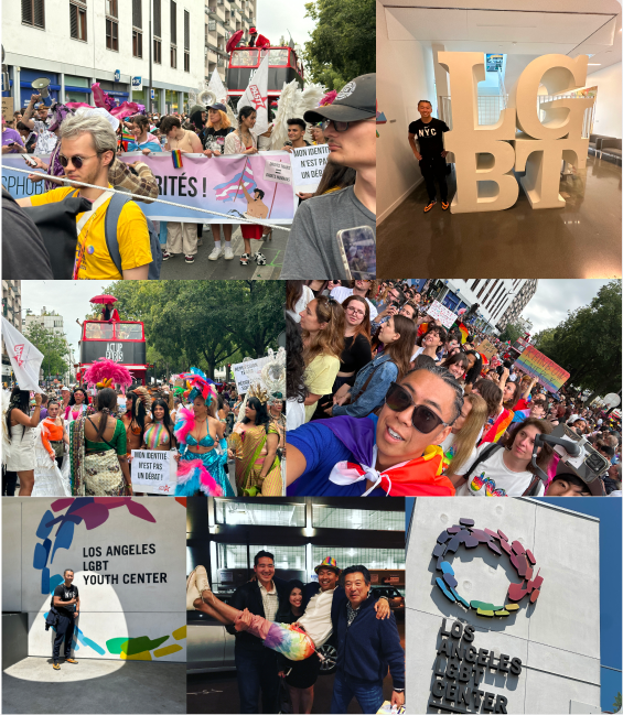
Background of the Organization’s Establishment
The SLGBTQ+ CENTER was established to promote understanding and communication surrounding SLGBTQ+ issues.
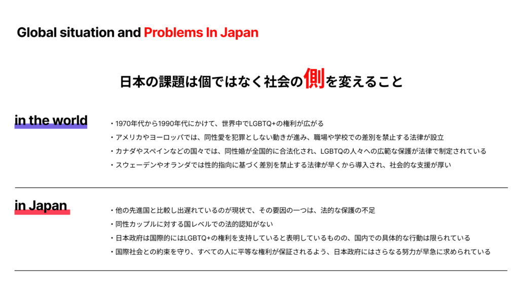
In recent years, global awareness and acceptance of LGBTQ+ communities have grown significantly. However, in Japan, this understanding has yet to reach widespread acceptance, leaving many individuals hesitant to voice their identities and experiences.
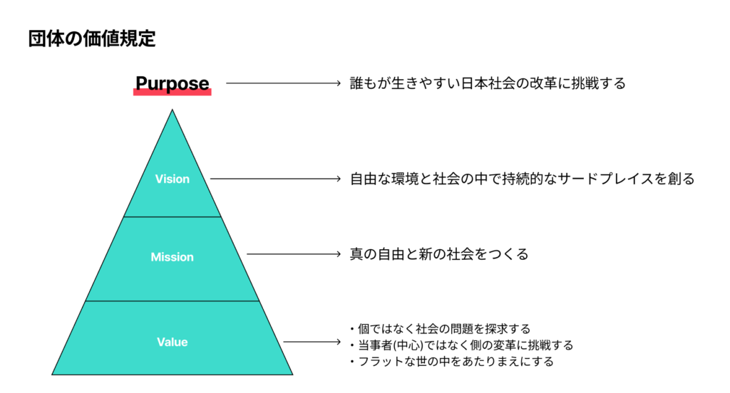
Achieving true equality and societal reform requires dialogue and engagement with everyone, including straight individuals. Our vision is to create a future where SLGBTQ+ becomes a standard and natural part of society, allowing everyone to confidently express their preferences and identities in a flat, inclusive environment.
To this end, we have expanded the traditional term “LGBTQ+” by adding “S” for straight, advocating for a “new normal” that transcends diversity. By fostering understanding and supporting reform, we aim to build a more inclusive and compassionate society for all.
Logo Concept
ロゴのコンセプト
The Möbius loop, a surface with no distinction between inside and outside, symbolizes the SLGBTQ+ CENTER’s commitment to breaking down barriers between all genders (SLGBTQ+) and fostering unity beyond distinctions. This loop represents the vision of creating a flat, inclusive society where everyone is connected without boundaries.
The Möbius loop also signifies “infinity,” reflecting the CENTER’s dedication to continuous improvement and growth. Designed with a gradient based on the colors of the rainbow flag, it encompasses all genders and identities, serving as a vibrant representation of inclusivity.
This logo stands as a beautiful metaphor for infinite possibilities, guiding the mission and vision of the SLGBTQ+ CENTER in building a more unified and accepting society.
- Creative Director: Raiya Mori ( BlurBra Inc. )
- Art Director: Takeshi Hirakawa ( BlurBra Inc. )
- Designer: Yukari Okada ( CYAN )
- Copywriter: Satoshi Hashimoto
- Communication Director: Shunsuke Nishioka (PIVOT Inc.)